
Perfect business decisions start when the right data is at your fingertips. Decisions taken based on clear, actionable insights can lead to specific growth, reduce risks, and sharpen your competitive edge in today’s competitive industry.
That’s where reporting tools are so essential. They organize all your business data continuously, whether it’s about marketing, sales, finance, or operations. So, you can pursue what matters, spot issues early, and make smarter choices based on real numbers with the right tools.
But not every tool is worth your time. Some are too complex, and some don’t offer enough, so how can you pick the right one? That’s why today’s article covers the top 6 reporting tools that can help you make better business decisions.
What are Reporting Tools?
A reporting tool is software that helps you to make sense of your business data. In simple terms, it collects information from different sources, organizes it, and displays it in a way that’s easy to understand, like charts, graphs, or dashboards. That’s how you get obvious insights that help you spot trends, solve problems, and make smarter decisions to improve how your business runs instead of trolling through spreadsheets.
Top 6 Reporting Tools For Making Better Business Decisions
1. Microsoft Power BI
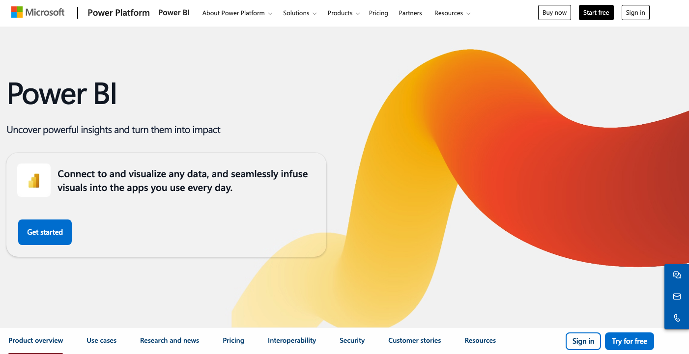
Microsoft Power BI is a well-known business intelligence tool that enables you to analyze data, create interactive reports, and visualize up-to-date trends. It can connect easily with other Microsoft tools such as Excel, SharePoint, and Azure, which attract businesses that are already using these platforms. You can create custom dashboards and reports that display key performance indicators (KPIs) with Power BI.
Moreover, Power BI can manage large amounts of data and deliver real-time insights. Undoubtedly, it's a great one for businesses of all sizes, for ease of use and powerful features. It would not be wrong if we say that you can stay on top of your business performance with this tool.
2. Tableau

Tableau is a renowned tool for its user-friendly interface and captivating data visualization services. You can produce interactive reports and dashboards to customize data according to requirements within Tableau. It also links with various data sources, including spreadsheets, SQL databases, and cloud services, to provide versatility in your existing workflow.
Do you know what makes it special? Tableau has the ability to turn complex datasets into attractive visual insights. Tableau interactive graphs and charts make the data more interpretable, whether you're tracking sales trends, customer behavior, or business performance. It can be the best tool for businesses that want to review deep into their data and get a quick understanding.
3. Looker Studio (formerly Google Data Studio)
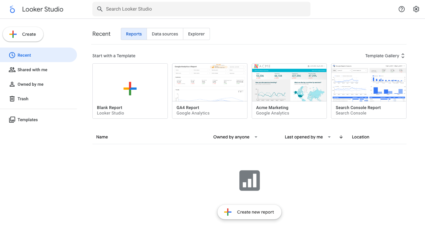
Looker Studio is a free tool that helps to create eye-catching and interactive reports and dashboards. It’s the finest choice if you are already using Google products like Google Analytics, Google Ads, and Google Sheets. Looker Studio makes it easy to link data, produce customized reports, and share them with teams or clients in real time.
Looker Studio's simplicity and collaboration features make it a better one among others. If you are the businesses that need a cost-effective solution for reporting and don’t want to spend too much on expensive software, it's all you need.
4. Zoho Analytics
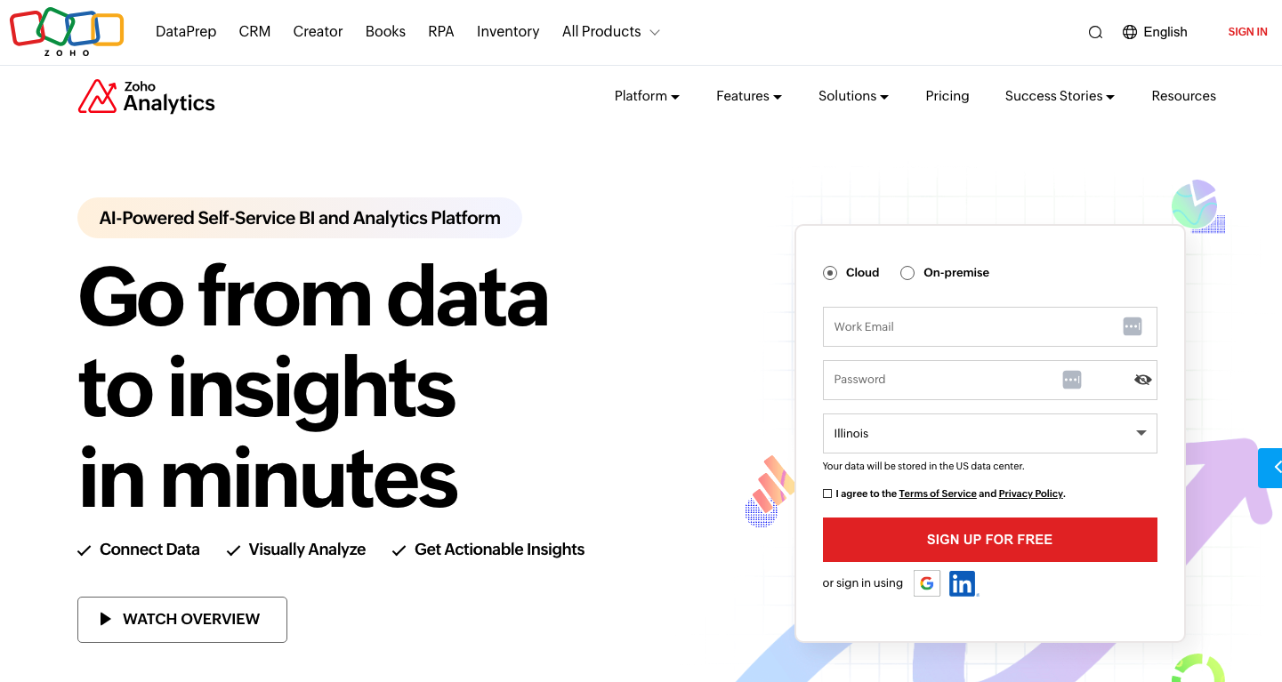
Zoho Analytics self-service assists businesses in analyzing their data and generating reports. It’s part of the Zoho suite, which helps to make it a prominent option for companies already using Zoho’s CRM or other software. You can create thorough reports and dashboards to track business performance and share insights with your team with Zoho Analytics.
The tool supports integration with different data sources, so bringing data from multiple systems is a click away. Smarter decisions for your business wellness come easily with Zoho Analytics' powerful AI-powered insights and data blending features.
5. Whatagraph
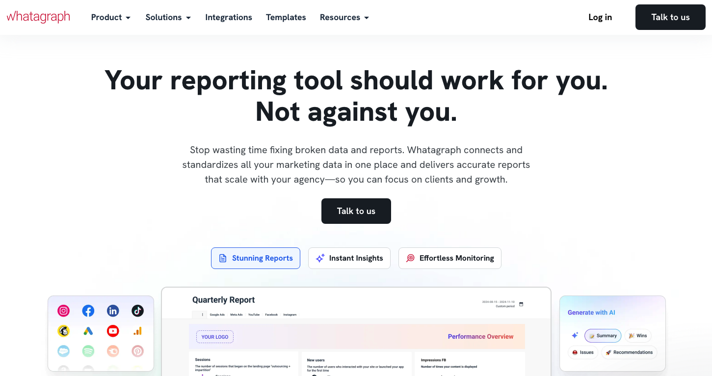
Whatagraph is another reporting tool designed specifically for marketers. It connects with multiple marketing platforms, including Google Analytics, Facebook, and Instagram, to create visual, easy-to-understand reports. Whatagraph can save a lot of time by automating report creation and bringing data from multiple sources if you have to manage marketing campaigns.
Rest assured that you can quickly get the performance of your campaigns with Whatagraph, which monitors key metrics and identifies areas for improvement. You can easily standardize your reports with its customizable templates, and the user-friendly interface, which ensures that even non-technical users can have a professional report without any hassle. So, Whatagraph is worth considering if you’re looking for a hassle-free method to report campaign results.
6. Metabase
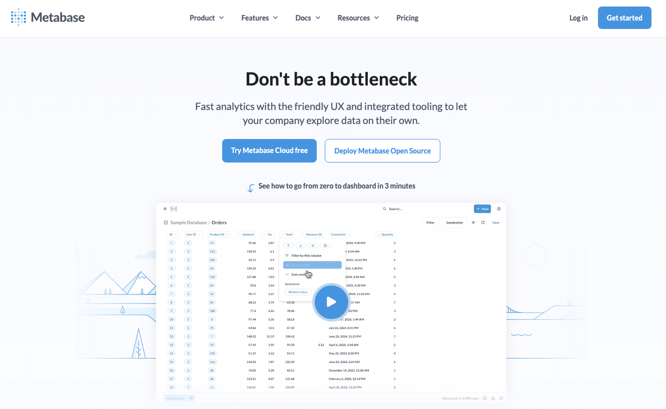
Metabase is a famous open-source business intelligence tool for businesses to ask questions about their data and get quick answers. It doesn’t require any coding knowledge, so non-technical teams can also consider it. Metabase offers a simple way to produce reports and dashboards tailored for users.
Metabase can perform with a variety of databases and its customizable reporting options. Metabase’s intuitive interface lets you create reports at once, whether you need to create a complex sales report or track website traffic. It can be a cost-effective solution for you if you want to start using data-driven decision-making without investing more in expensive software.
Simple Alternatives to Complex BI Solutions
For users who find tools like Power BI, Tableau, or Looker Studio too complex for their everyday needs, there are several easy-to-use alternatives that offer essential data handling and visualization capabilities without the learning curve.
Google Sheets is a great starting point—it allows for basic data tracking and chart creation, and integrates well with other Google Workspace tools for quick sharing and collaboration. For visual reports, Canva offers data presentation templates where users can manually input figures and turn them into infographics with zero coding required. Similarly, tools like Datawrapper and ChartGo provide drag-and-drop interfaces to turn CSV or Excel files into publishable bar graphs, line charts, or maps.
If you’re simply looking to convert reports or tables into a more shareable format, options like Excel to PDF or Excel to JPG work great for creating static summaries. Even Microsoft Excel’s built-in PivotTables and charts can offer valuable insights with just a few clicks, making it a reliable, user-friendly fallback for many small businesses and freelancers who don’t need the power (or price tag) of a full-scale BI platform.
Wrap Up
These are the top recommended tools for your business to analyze data deeply and organize it conveniently. There are a lot of options in the market, so always consider features before using. That can help to make better business decisions easily for the desired consequences.
Share this post
Leave a comment
All comments are moderated. Spammy and bot submitted comments are deleted. Please submit the comments that are helpful to others, and we'll approve your comments. A comment that includes outbound link will only be approved if the content is relevant to the topic, and has some value to our readers.
Comments (0)
No comment